
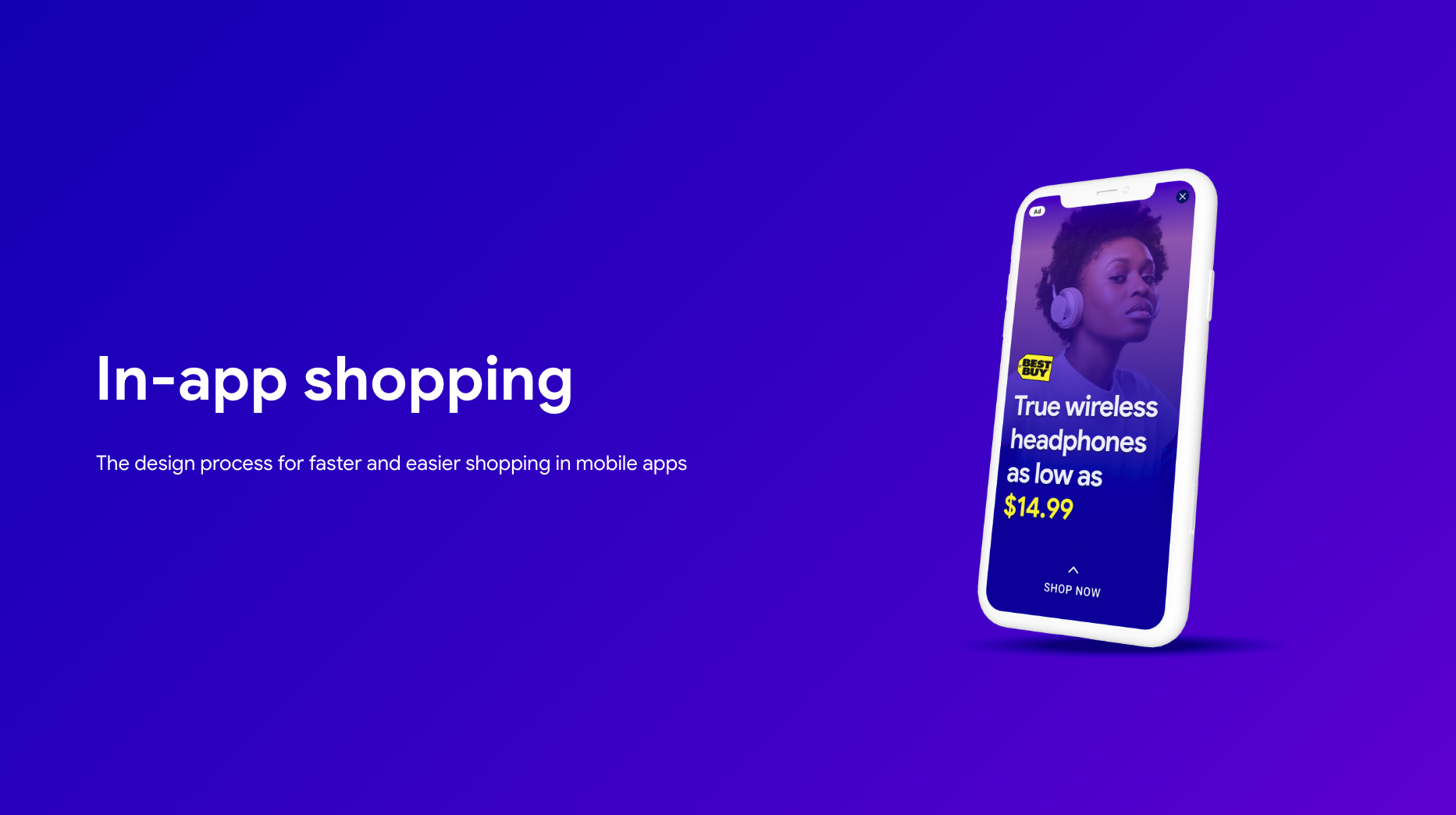
Redefining In-App Commerce
I led the design for a new in-app shopping ad format at Meta. My goal was to create a better experience for users while also improving results for advertisers. The new design increased click-through rates by 15% and advertiser ROI by 15%.
My Role
Strategy
- Planned, organized, and led a design sprint to define the project's direction.
- Collaborated with PMs to define the UX strategy, deliverables, and timelines.
Team Leadership
- Organized and led weekly design and engineering review sessions to ensure alignment.
- Mentored and provided guidance for a junior designer on the team.
Design
- Collaborated with three cross-functional UX teams to ensure a cohesive experience.
- Designed the end-to-end final product, from wireframes to high-fidelity prototypes.
The Product
These shopping ads appear at natural breaks in mobile apps, like between game levels. The new format was designed to let users browse and shop for products without having to leave the app they are currently using.

Defining the Problem
Performance data showed a high bounce rate. When users tapped on an ad, they were immediately taken out of their current app. This interruption caused many people to abandon the process right away. This high bounce rate directly led to a lower conversion rate and, as a result, less revenue for the business.

Research & Concepts
The research led me to a key persona, "Paddi," who represented our typical user. She was happy to discover new products but hated being interrupted or forced into a complicated process.
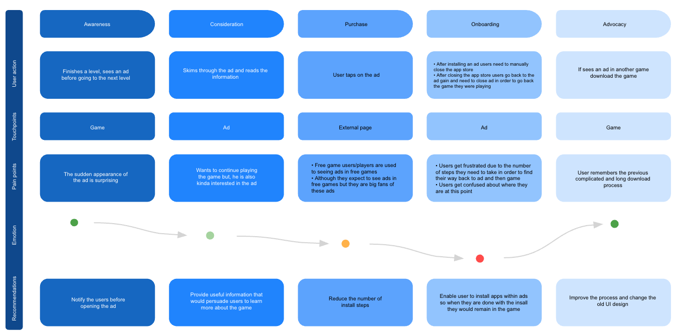
“I just want to see if I like it quickly. Don't make me leave the game I'm playing to go to a whole different app unless I’m ready to buy.”
This quote confirmed our old approach was wrong. Based on this, I sketched out three different concepts to explore with my team.
Concept A: Tabbed Modal
Con: This felt too complex and would overload the user with information.
Concept B: Mini-Browser
Con: This was slow to load and still felt like a major interruption.
Concept C: Expandable Card
Pro: This was simple, fast, and clear. This was the direction we chose.
Competitive Analysis
Before designing, I analyzed competitor ad formats to identify common patterns and find opportunities to create a better experience.
| Rewarded Video | Interstitial | In-Feed Social | Our New Format | |
|---|---|---|---|---|
| Seamless UX | ||||
| Direct Purchase | ||||
| Multi-Product | ||||
| Brand Customization |
Key Pain Points
From our research, three major pain points emerged that became the focus of my design work.
1. Confusing User Flow
The user flow was confusing and disruptive. Our research showed that 7 out of 10 users were frustrated by being forced out of their app and into a browser.

2. Lack of Brand Identity
Advertisers felt the generic ad format did not represent their brand well. 9 out of 10 advertisers we surveyed complained about the lack of brand identity.
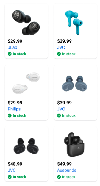
3. Lack of Scalability
The format wasn't scalable for advertisers with larger catalogs. 8 out of 10 advertisers wanted to showcase multiple products at once.
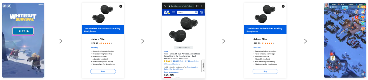
Solution & Validation
The final design was a simple, expandable card. It showed just enough information to be interesting and let users easily see more if they were curious. I worked closely with engineering to find a simple animation that felt smooth and kept the user oriented.

User Feedback
“This was so much better than being kicked out to a website. I could see everything I needed right there and then get back to my game.”
“It felt safe and trustworthy because it was all part of the same window. I liked that I didn’t have to open a new browser.”
The Impact
We tested the new format for two months and the results were very positive. It was a clear success for users, advertisers, and the business, so we rolled it out to all users.