
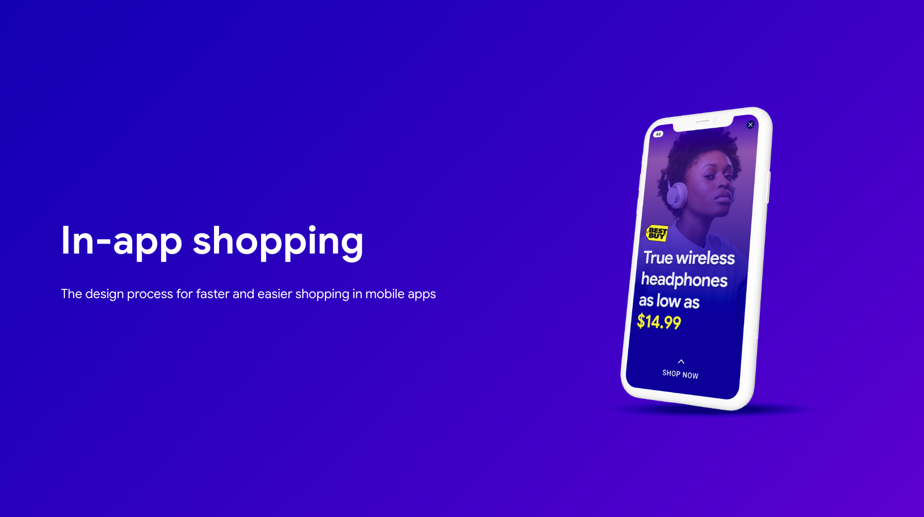
Redefining In-App Commerce
I led the design for a new in-app shopping ad format at Meta, keeping users inside their host app and turning bounce-outs into purchases.
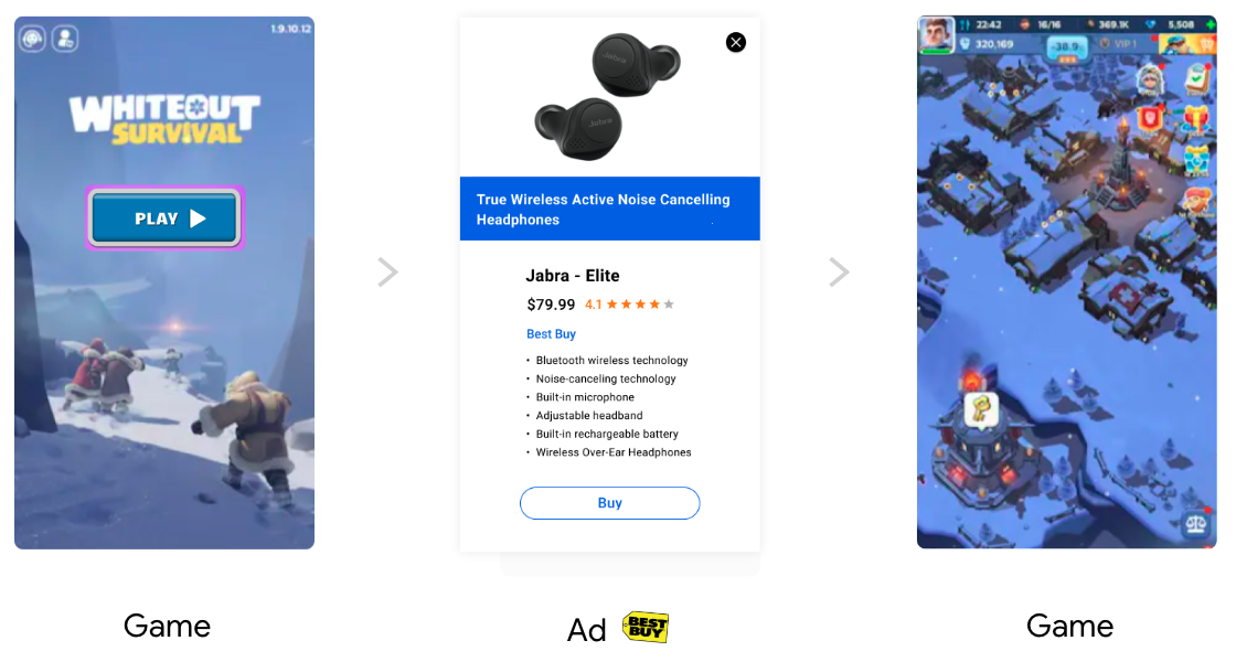
Problem: Tapping ads kicked users out to an external browser, which caused high bounce rates and lost purchase intent.
Approach: Keep the entire flow in-app using an expandable card and embedded checkout, add brand customization, and use ML to select high-performing layouts.
Outcome: The new format reduced immediate exits, increased exploration, and showed stronger purchase progression in test markets.
My Role
Strategy
- Planned, organized, and led a design sprint to define the project's direction.
- Collaborated with PMs to define the UX strategy, deliverables, and timelines.
Team Leadership
- Organized and led weekly design and engineering review sessions to ensure alignment.
- Mentored and provided guidance for a junior designer on the team.
Design
- Collaborated with cross-functional UX teams to ensure a cohesive experience.
- Designed the end-to-end final product, from wireframes to high-fidelity prototypes.
The Product
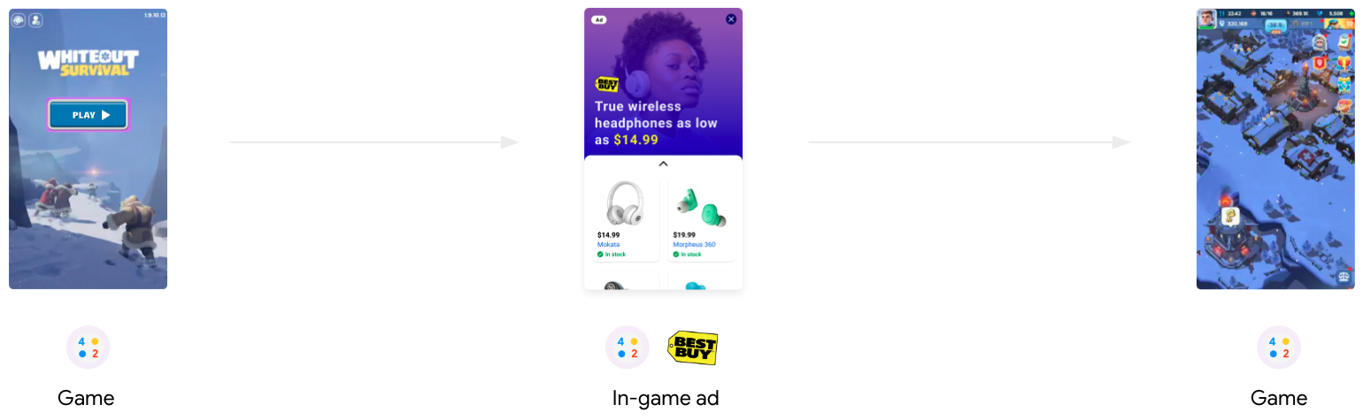
These shopping ads appear at natural breaks in mobile apps, like between game levels. The new format lets users browse and shop without leaving the app they’re using.
Defining the Problem
Performance data showed a high bounce rate. When users tapped an ad, they were taken out of their current app. That interruption caused many to abandon immediately, which lowered conversion and revenue.

Research
Research led us to a key persona who loved discovery but disliked interruptions or complex flows.
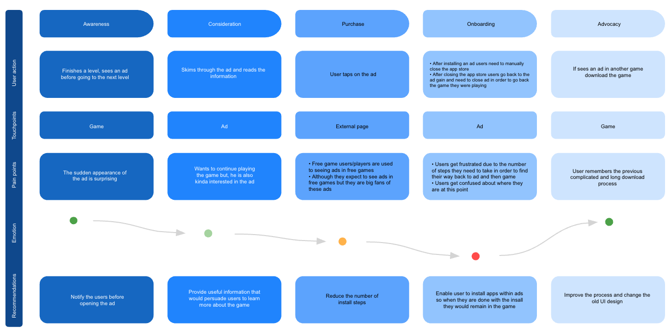
“I just want to see if I like it quickly. Don’t make me leave the game I’m playing unless I’m ready to buy.”
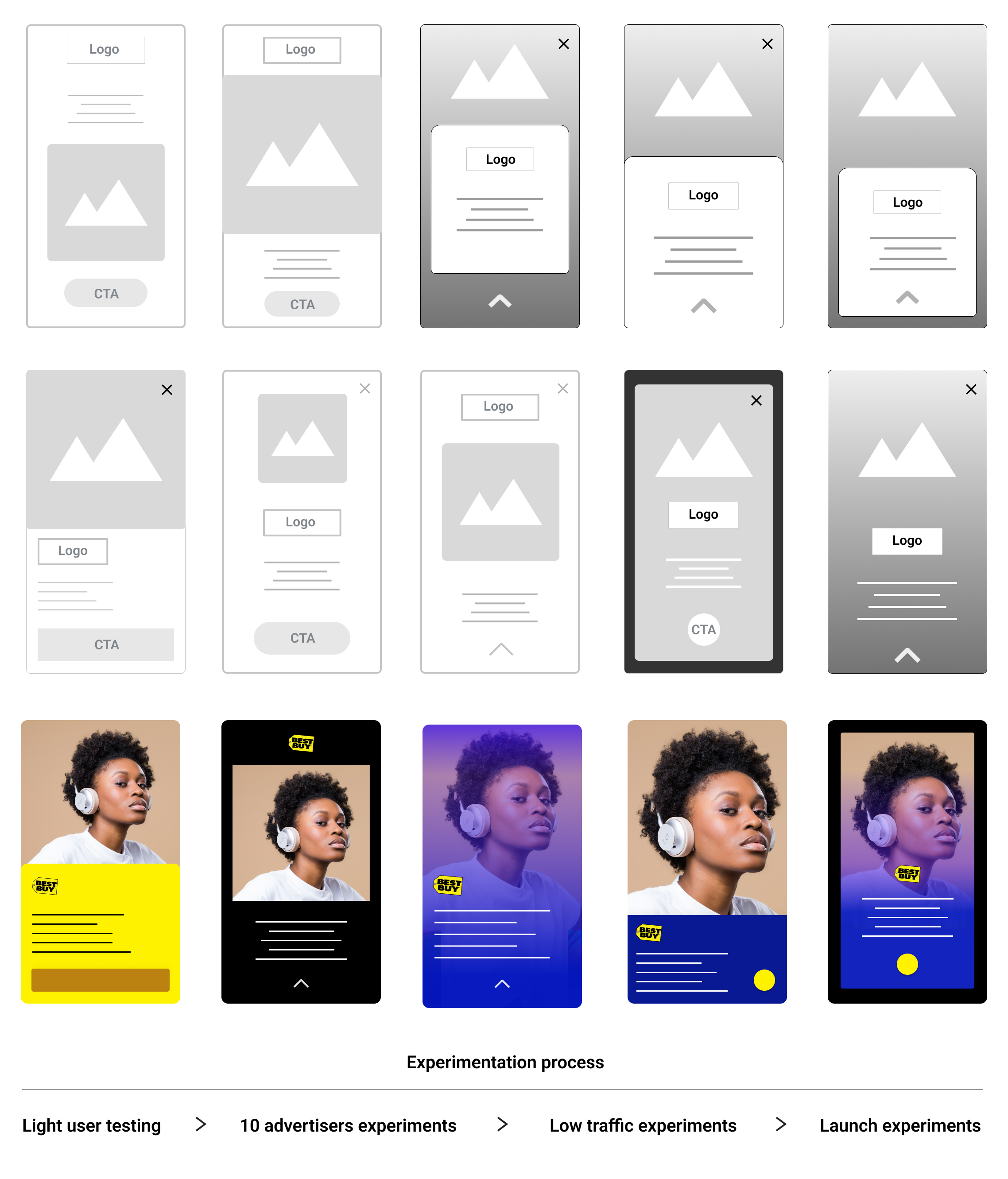
This confirmed we needed a design that let users see more without leaving the app. I sketched three concepts with the team.
Concept A: Tabbed Modal
Con: Too complex; information overload.
Concept B: Mini-Browser
Con: Slow; still a major interruption.
Concept C: Expandable Card
Pro: Simple, fast, and clear. We chose this direction.
Key Pain Points
Three major pain points became the focus of my design work.
1. Confusing User Flow
The flow was disruptive. Many users were frustrated by being forced out of the app into a browser, which felt disjointed.

2. Lack of Brand Identity
Advertisers felt the generic ad format didn’t represent their brand well and needed more customization.
3. Lack of Scalability
The single-item format didn’t support larger catalogs; they wanted to showcase multiple products at once.
Mission, Goals, and Scope
Mission
Enable consumers to buy directly within an ad—no forced jumps to external pages.
Goals
- Improve brand identity options for advertisers.
- Make the user flow seamless and intuitive.
- Increase user engagement and overall revenue.
Project Scope
To truly optimize the flow, we added support for showcasing multiple products, which expanded design and development work.
Initial Designs and Experiments
We ran multiple experiments across layouts, color systems, and interactions.
Machine Learning
We used data to identify which design elements were most effective and used that to improve and select the final designs.
User flow optimization
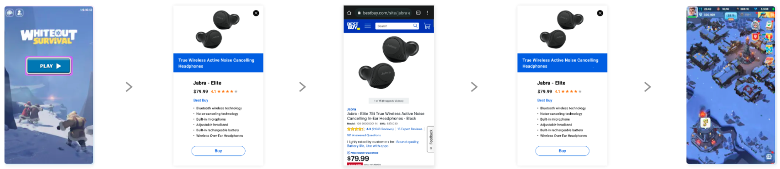
I designed a seamless experience that rendered the shopping flow—from initial ad to product feed and payment—inside the host app, keeping users in context.
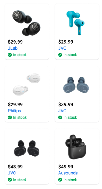
New Flow
I also created a simple ingestion path for product data (e.g., from spreadsheets) to populate an in-ad product feed so users could explore multiple items without leaving the app.
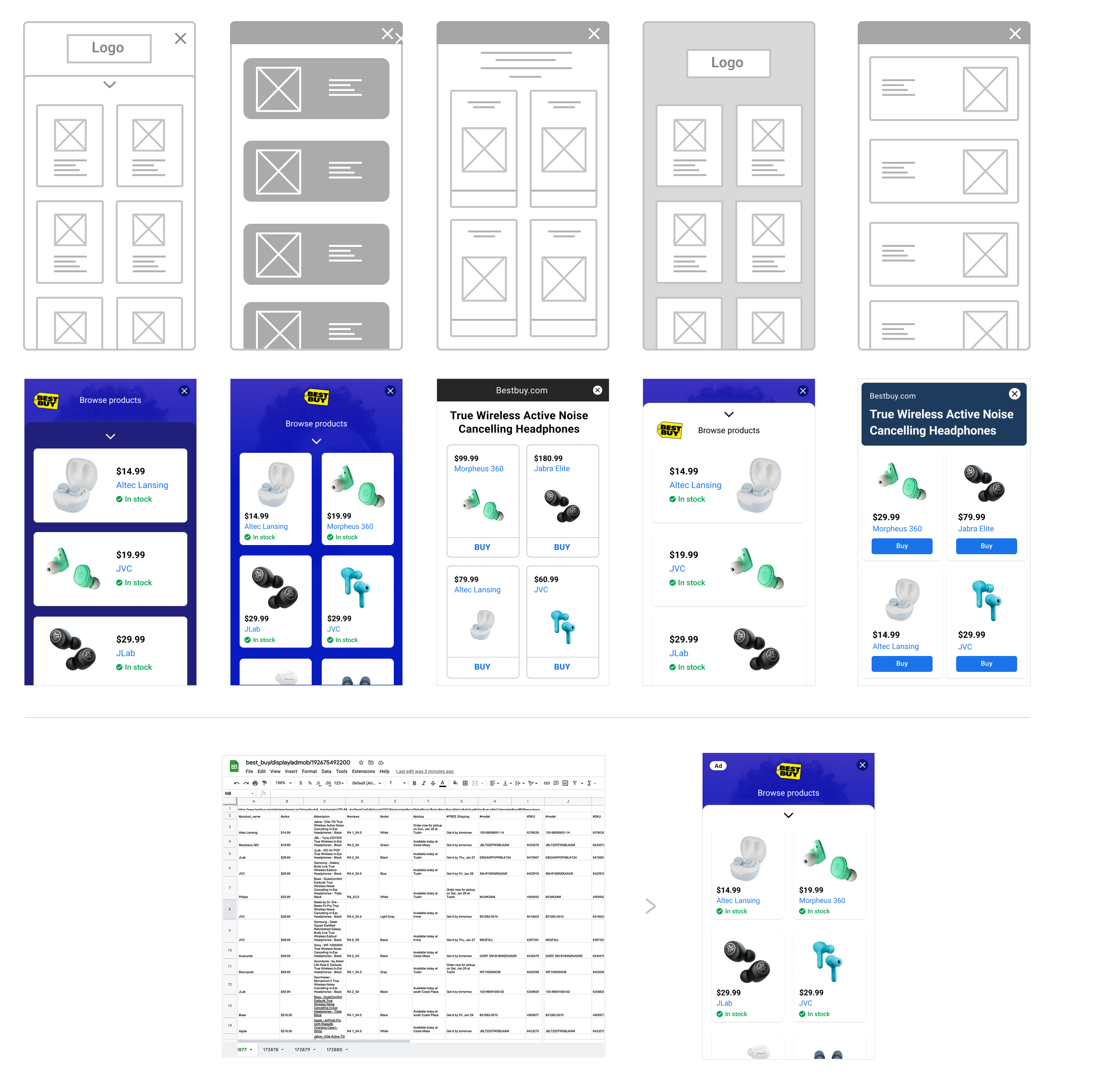
Wireframes
After defining the core user flow, I created detailed wireframes to map out the structure and layout of each screen.
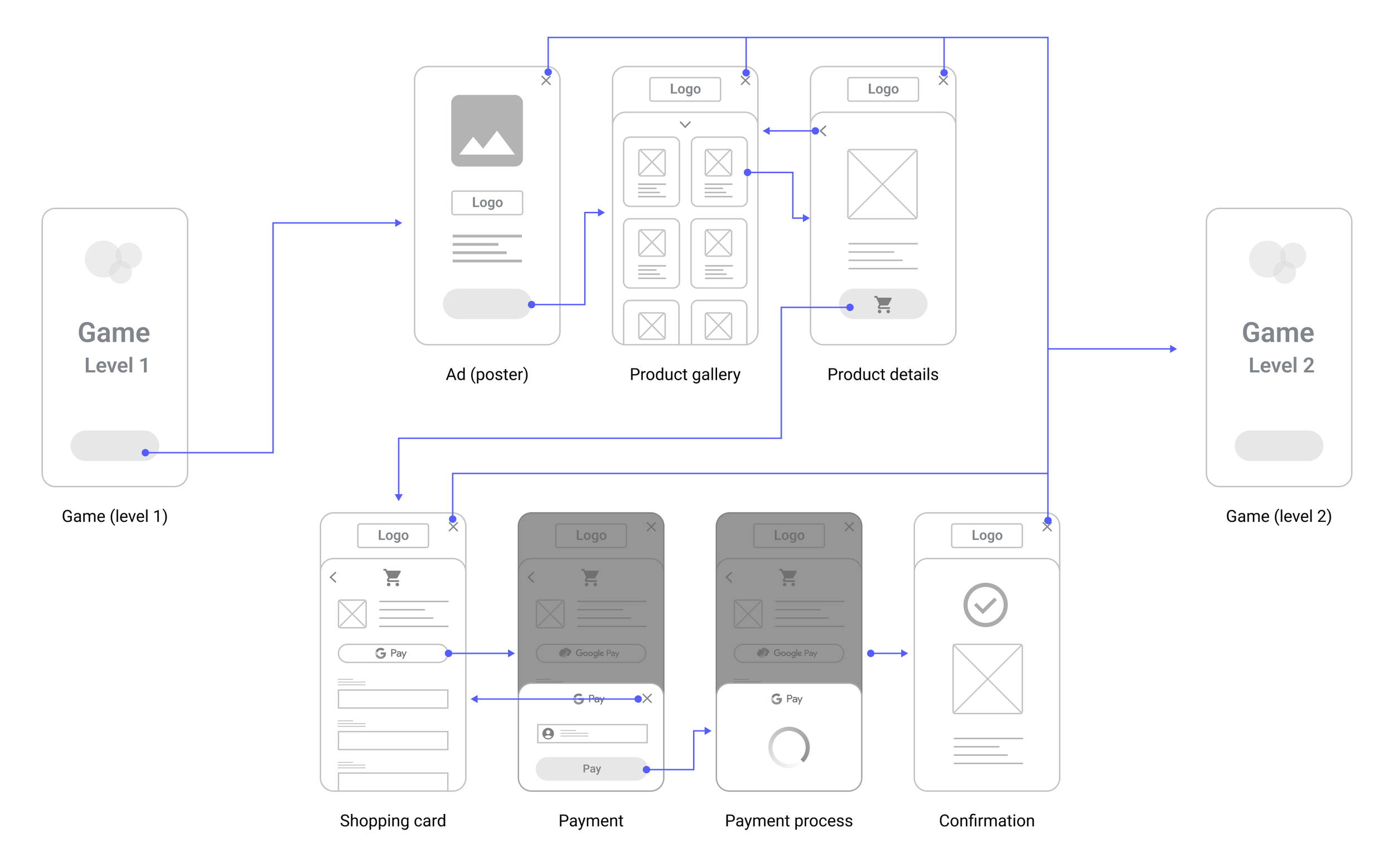
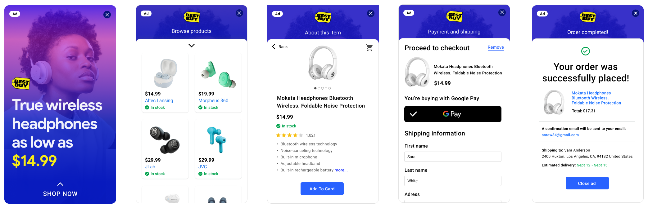
The Solution & Validation
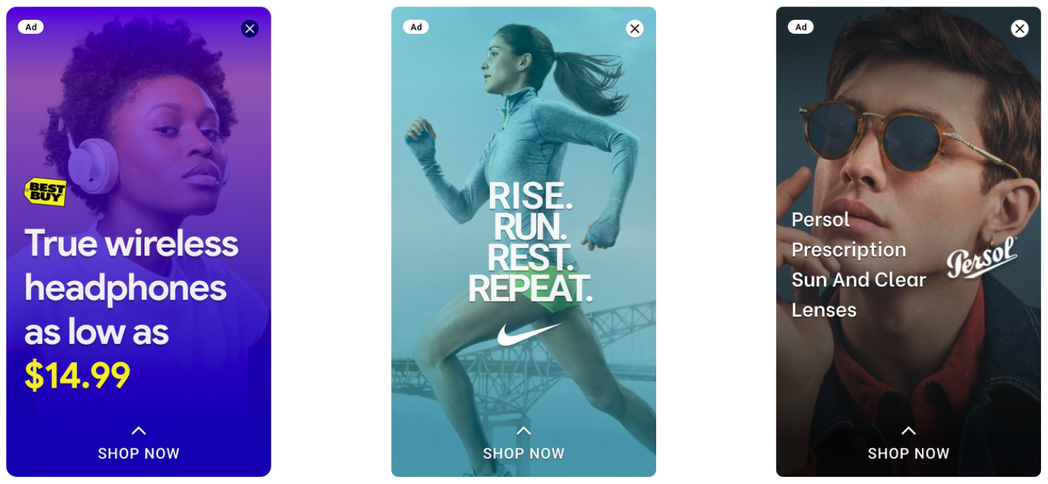
The final design is a simple, expandable card. It shows enough to invite interaction and makes it easy to see more. A technical animation constraint required a lighter approach; I partnered with engineering to keep orientation while meeting performance budgets.

Usability Testing
We ran unmoderated remote tests with frequent mobile gamers to assess clarity and ease of use of the new flow.
Scenario
You’re playing a game and an ad for headphones appears. Explore to learn more and start purchasing.
Metrics to Track
- Task Success Rate: Find product details and initiate checkout?
- Time on Task: How long to complete the flow?
- Satisfaction: Post-task rating on a 5-point scale.
Success Criteria
Success if at least 4 of 5 participants complete the task without errors and rate it 4+ for satisfaction.
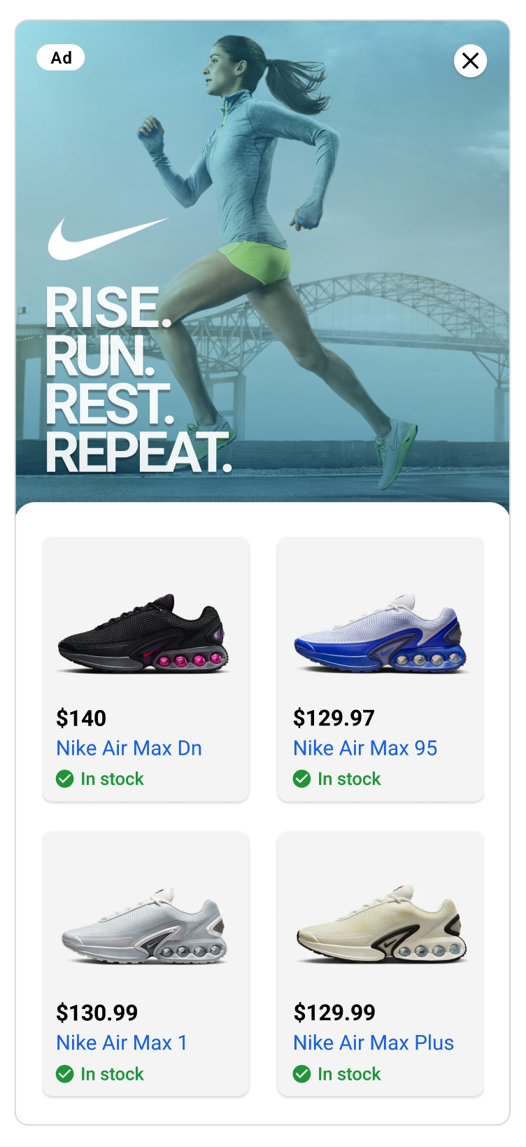
Feedback was positive; the main ask was for more product images, so we added a swipeable gallery in a later iteration.
User Feedback
“This was so much better than being kicked out to a website. I could see everything I needed right there and then get back to my game.”
“It felt safe and trustworthy because it was all part of the same window.”
The Impact
We tested the new format for two months; results were strong for users, advertisers, and the business, so we rolled it out broadly.
Constraints & Roadmap
Constraints & Trade-offs
- De-prioritized some advanced features due to cross-team dependencies.
- Smaller advertisers’ image quality varied; I set minimum standards.
Future Roadmap
- More payment options to streamline checkout.
- AI-generated product imagery for small advertisers.
- Explore interactive 3D models and AR try-on within the unit.